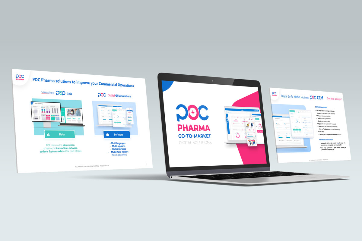
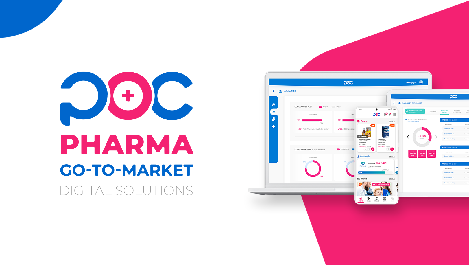
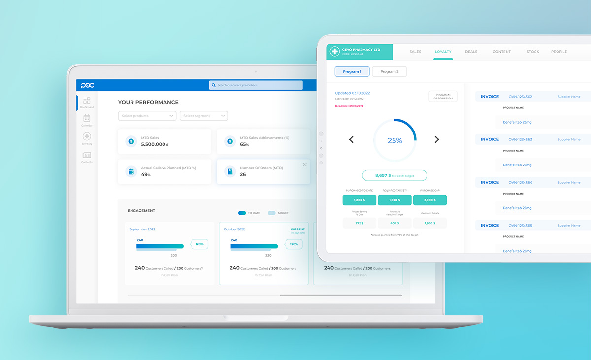
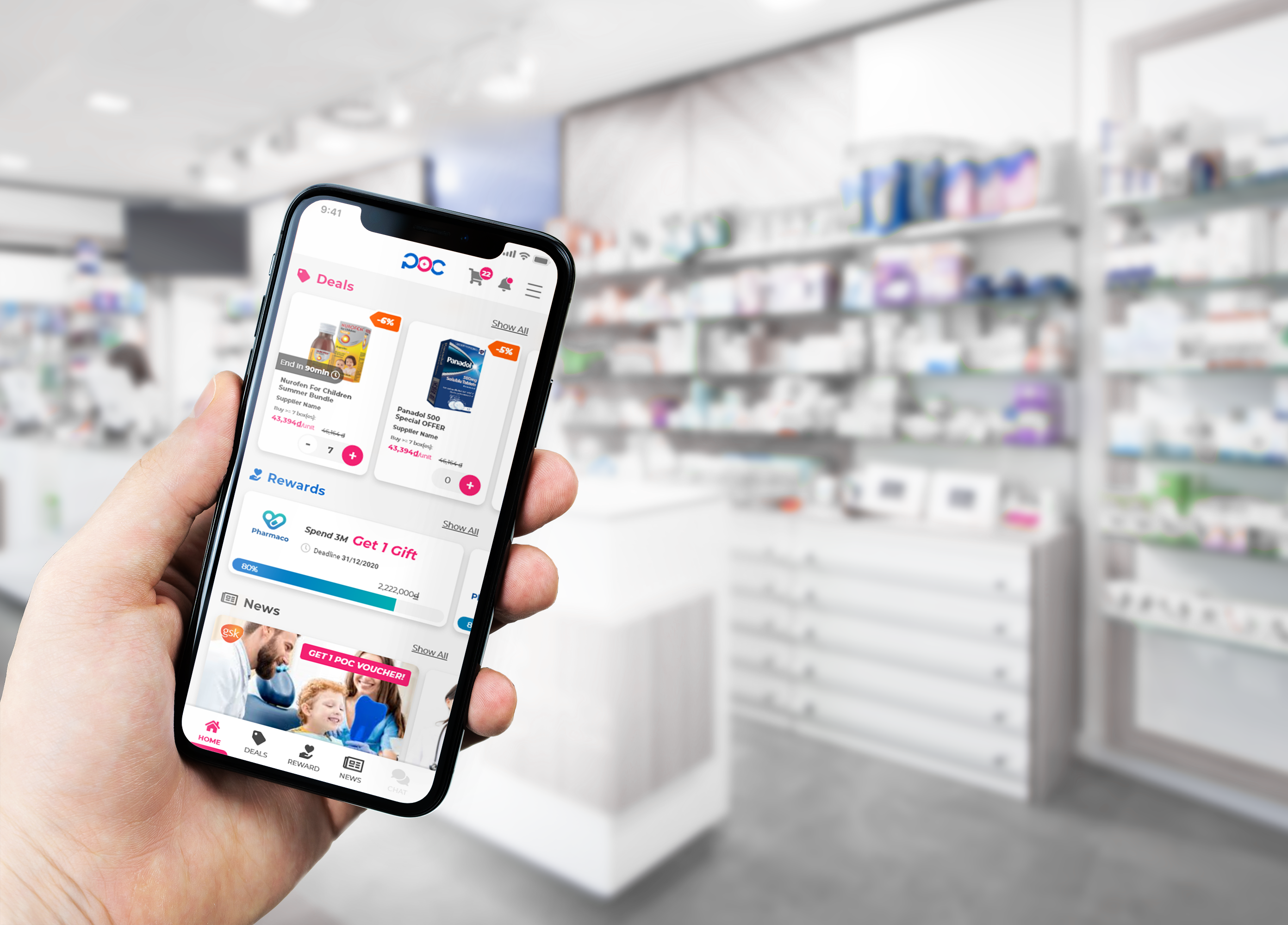
Here are a collection of designs created throughout POC's product life cycle,
offering you a deeper insight into POC's art direction.
It is consistently guided by the philosophy of being
Simple, Easy, Reliable, and Trustworthy


the P alone can be used only as favicon, thumbnail or avatar

The POC logo is used only in our interfaces and product communications
This is the “POC Pharma” umbrella brand logo, for official communications

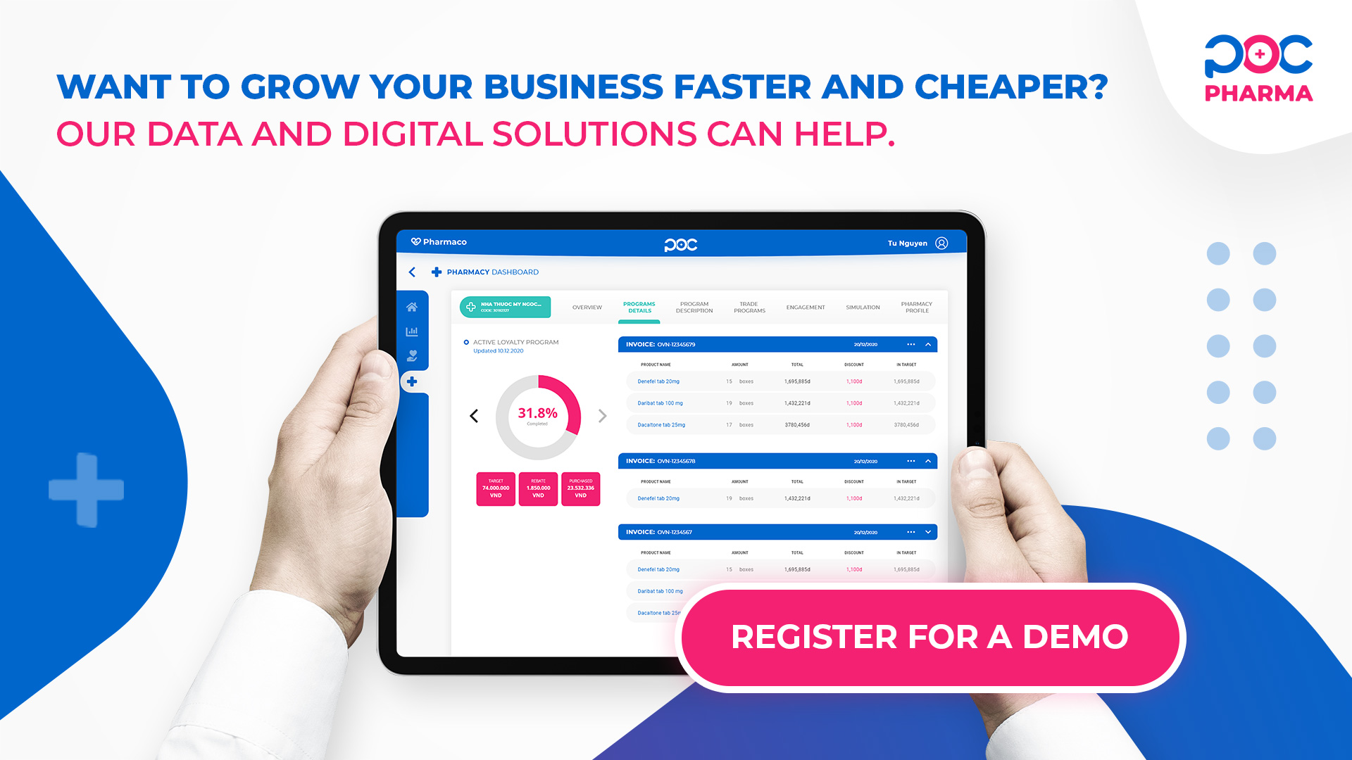
Logo used for our "Pay for Performance" digital solution

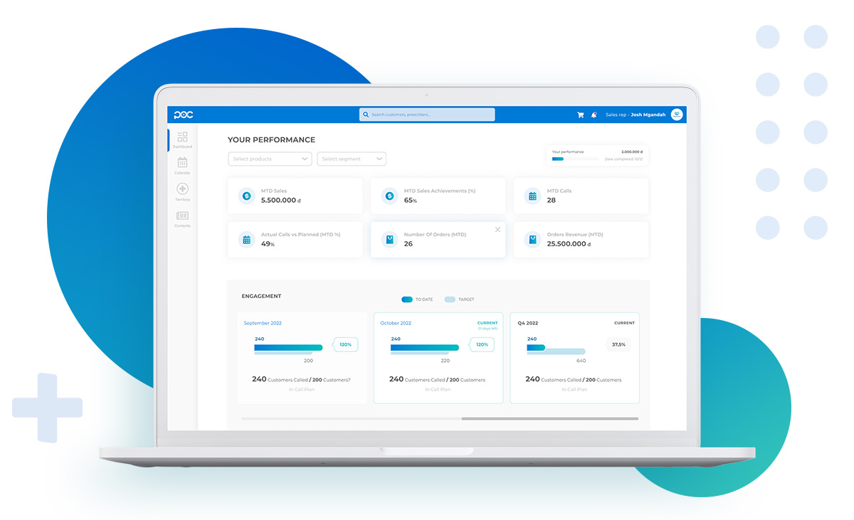
Logo used for our "Pharmacy observation post" analytics solution
In most cases, you won't be able to use the colored logo over a dark image or high-contrast background, so we recommend using the following white versions
download here

We use 3 main colors which are basically the 2 POC logo colors plus an additional complementary green.
Lorem ipsum dolor sit amet, consectetur adipiscing elit. Suspendisse varius enim in eros elementum tristique. Duis cursus, mi quis viverra ornare, eros dolor interdum nulla, ut commodo diam libero vitae erat. Aenean faucibus nibh et justo cursus id rutrum lorem imperdiet. Nunc ut sem vitae risus tristique posuere.
Lorem ipsum dolor sit amet, consectetur adipiscing elit. Suspendisse varius enim in eros elementum tristique. Duis cursus, mi quis viverra ornare, eros dolor interdum nulla, ut commodo diam libero vitae erat. Aenean faucibus nibh et justo cursus id rutrum lorem imperdiet. Nunc ut sem vitae risus tristique posuere.
Fonts play a crucial role in design, which is why we have carefully selected two minimalist and scalable font sets that contribute to our overall design aesthetic
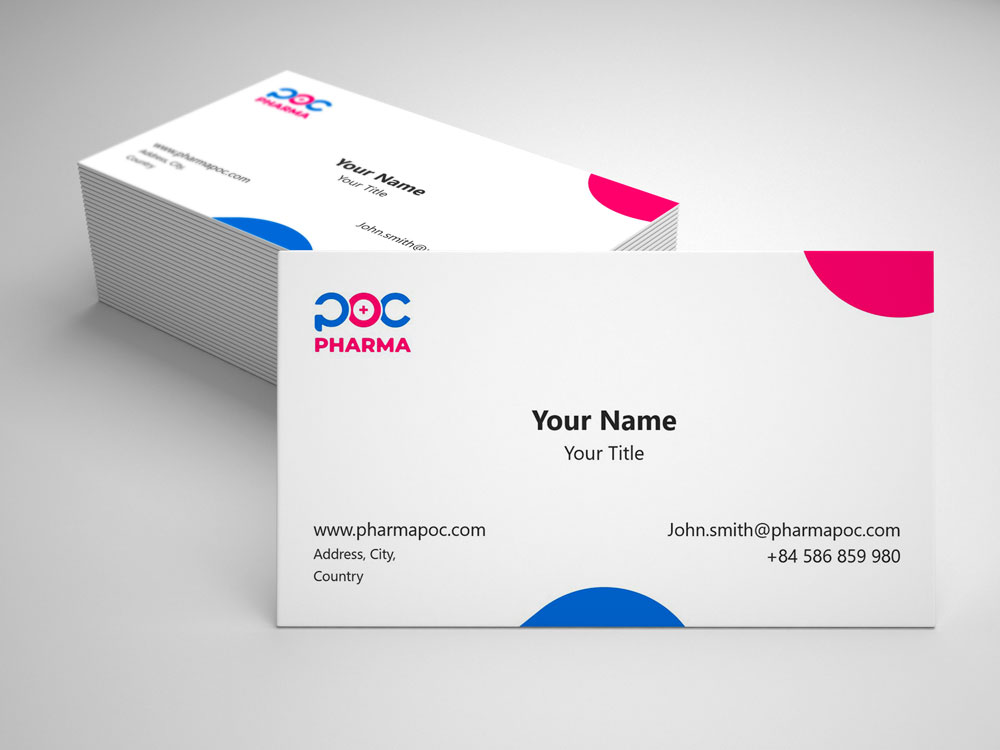
From your onboarding to your daily use at POC, you will find the most useful templates here.
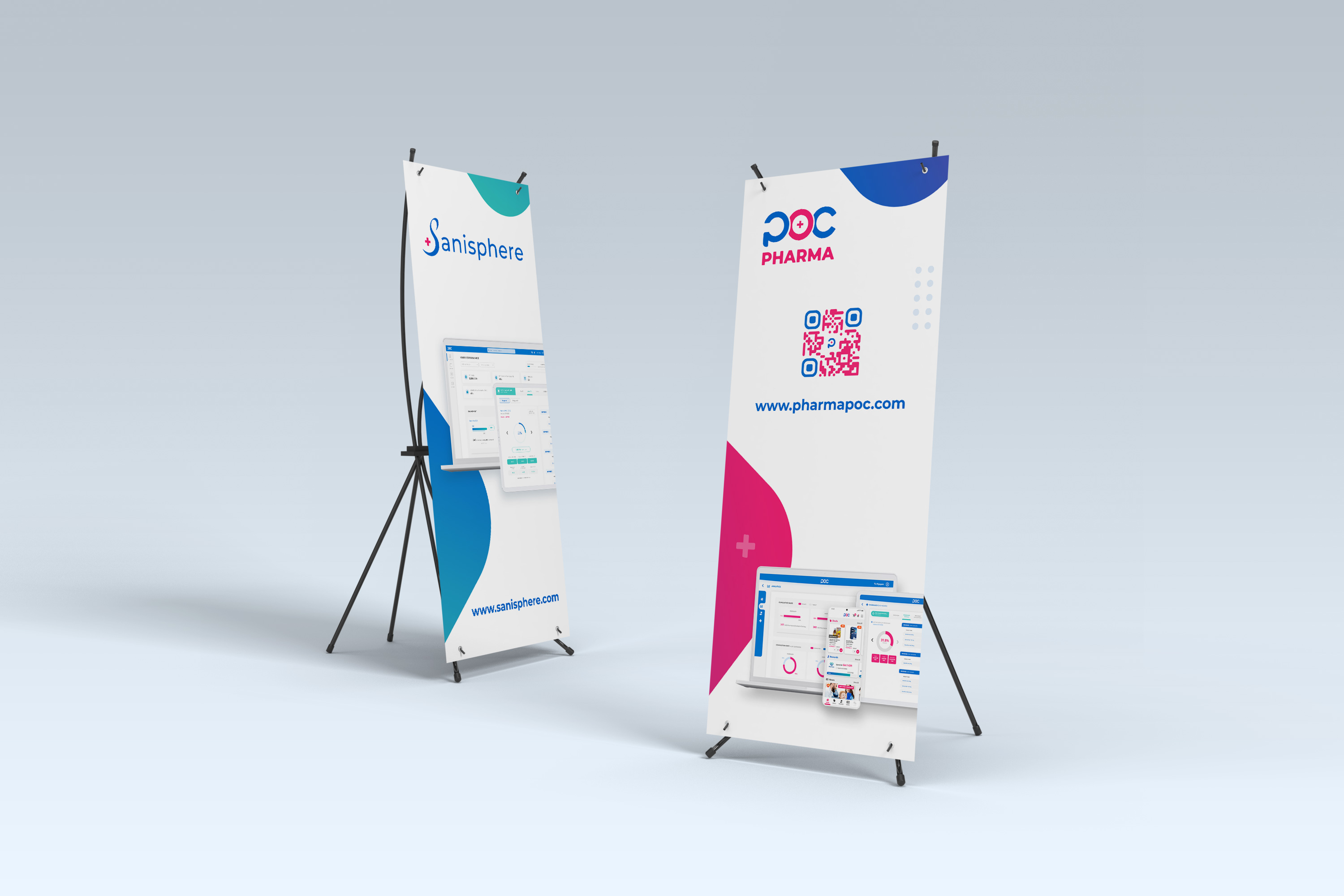
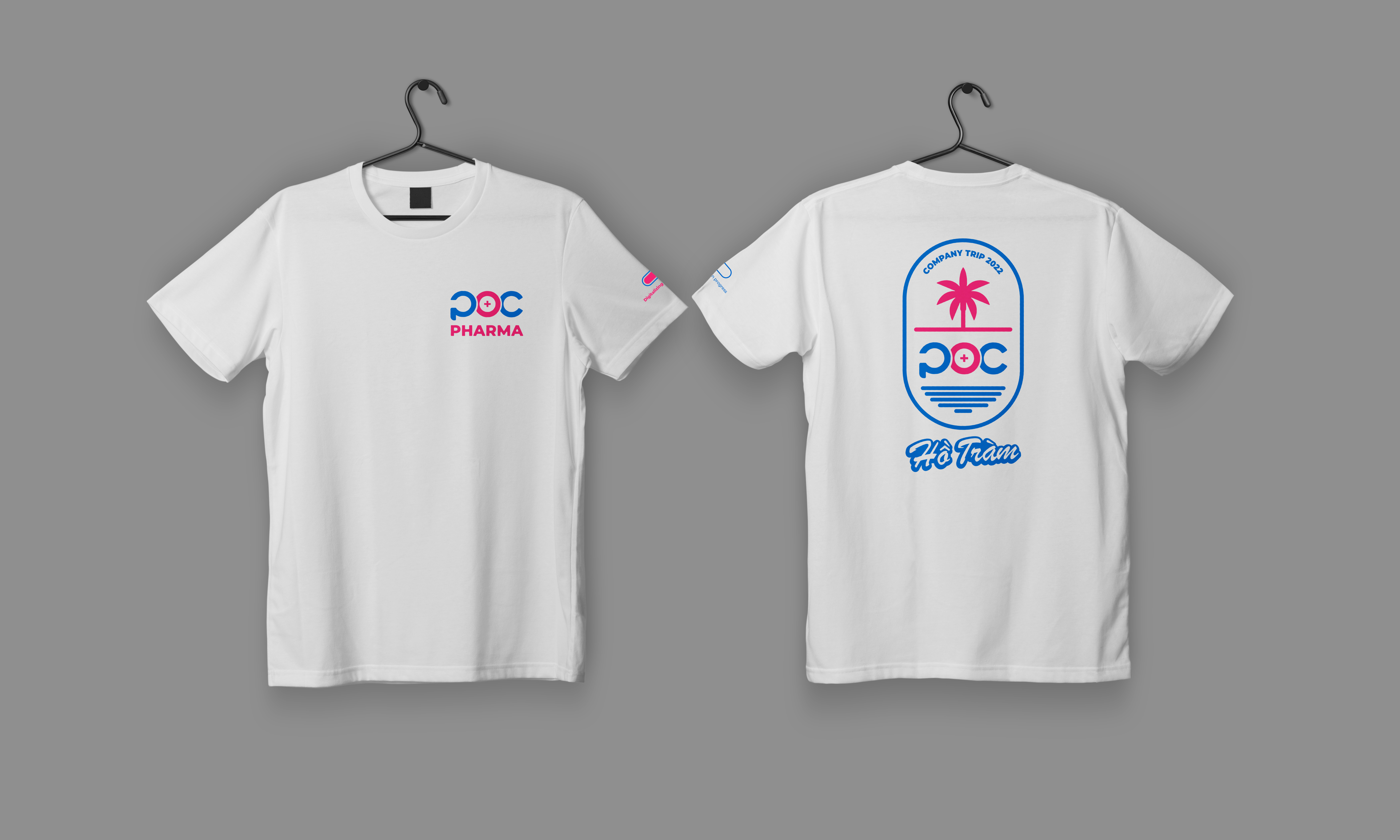
For inspiration only, here are some examples of goodies we have created for various events.
Feel free to contact the POC design team if you have any further questions.